Mo.
Bill Farr Photography, cowboy on horseback at golden hour
Case Study · 2026

From zero online presence
to a gallery on the internet.

Bill Farr shoots cinematic Western + travel photography, the kind of images that feel like film stills from a movie you almost remember. He had none of it online. No website, no gallery, no way to sell prints. This is the site that put him on the map.

Client
Bill Farr Photography
Role
Design + Build · Solo
Sector
Creative · Portfolio · Prints
Year
2026
01 · The brief

Zero to launched.

Bill came in with a portfolio most photographers only dream of, Western landscapes shot from horseback, working ranches, sunsets from three continents, and no digital footprint whatsoever. No website. No portfolio link. No online store. The work lived on SD cards, in phone galleries, and on the walls of the ranch families he shoots for.

The brief was blunt: get me online, and make it worth the wait. That meant three non-negotiables from the first call:

  • A first impression worth the delay. No template look. Every visitor had to feel like they'd stumbled onto a working photographer's gallery, not a landing page.
  • Build the print path in, not bolt it on later. Since this was launch #1, the gallery had to carry a working route to a print purchase, so switching the store on would never mean rebuilding the site. Bill decided to launch the gallery first and open the store when his print workflow was ready, so it ships wired and switched off.
  • Own the Western + travel niche visually. An editorial voice that signals museum-quality prints, because that's the price point we were positioning for.
02 · Homepagecinematic hero · silent motion
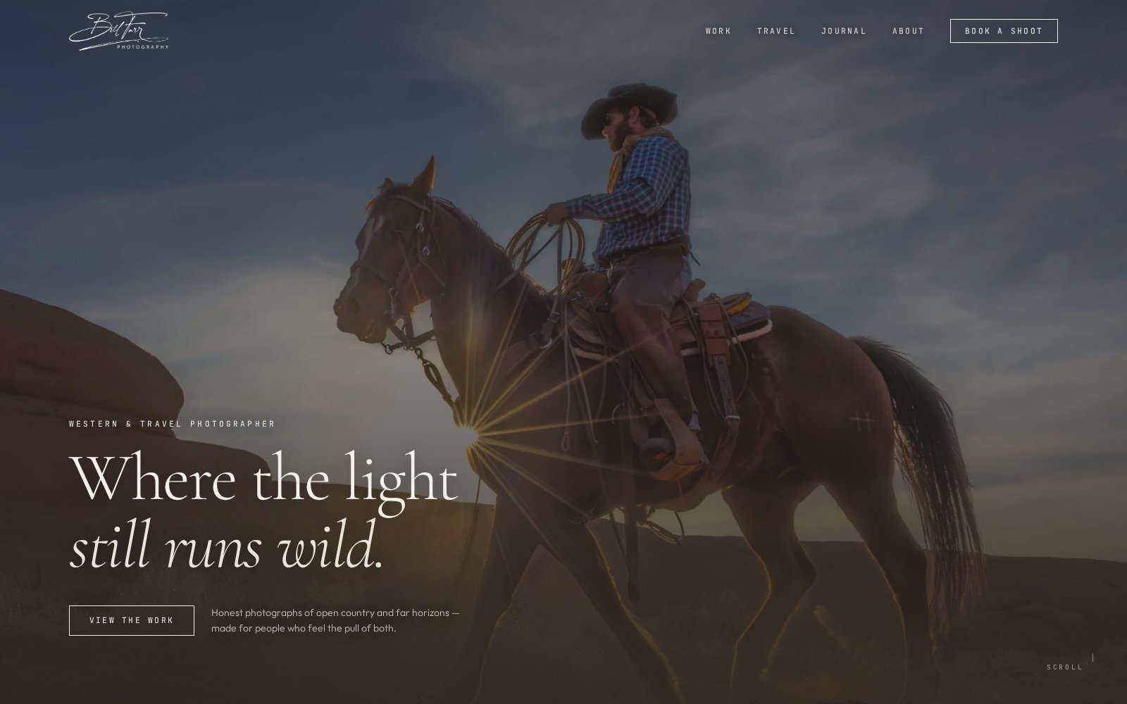
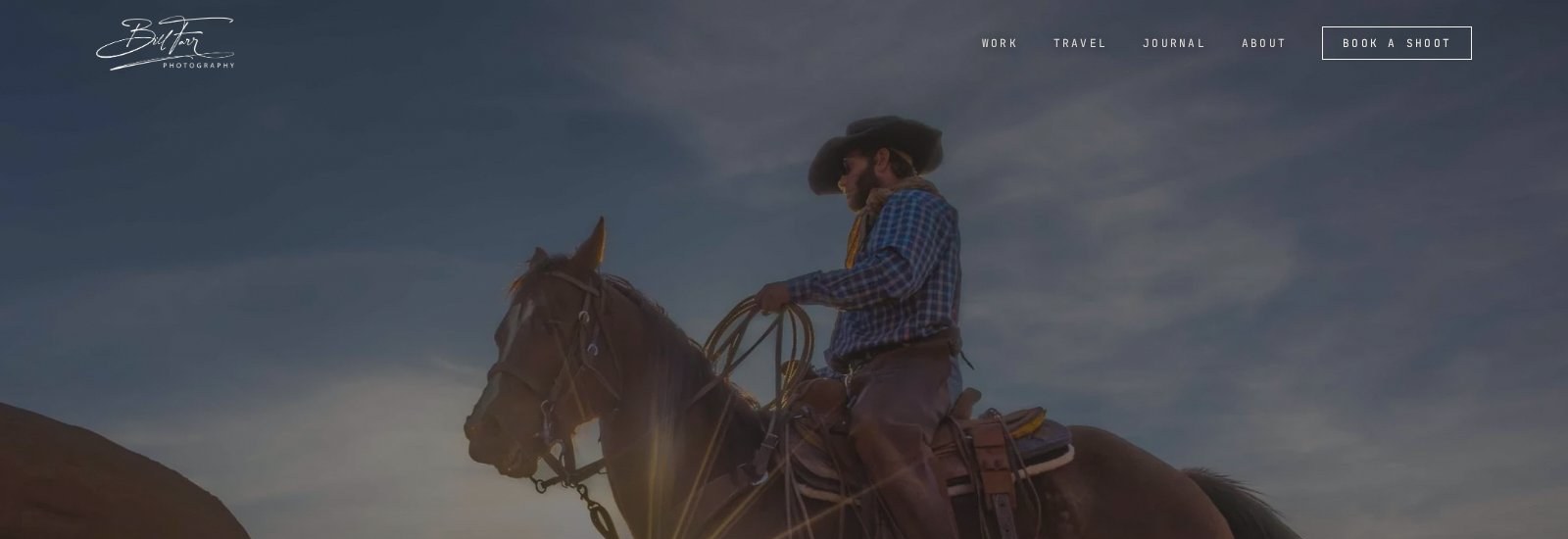
Bill Farr Photography homepage, Where the light still runs wild
The homepage is a single photograph, a single sentence, and a single CTA. Everything else waits below the fold. Time-to-emotion under 1 second.
03 · Approach

Three rules for the build.

Every design decision, nav, spacing, type, motion, was tested against these three rules. If a component broke any of them, it didn't ship.

01

Images first

The photograph is the product. Everything else, nav, type, spacing, bends to serve it.

  • ▸Full-bleed cinematic hero, no crop, no frame, no distraction
  • ▸Silent, autoplay-safe animation on scroll
  • ▸Reserved-space image containers so nothing jumps as galleries load
02

Editorial pacing

Long-scroll storytelling with breathing room, the feeling of holding a photo book, not a marketing page.

  • ▸Two-column and single-column shifts to break rhythm
  • ▸Serif display + monospace overlines, magazine, not tech-bro
  • ▸Section captions that read like curated exhibit plates
03

Print-store ready

Print sales are the revenue engine, the site is engineered around low-friction buying, not just browsing.

  • ▸Hero → work → print detail flow, built so the print store can switch on without a rebuild
  • ▸Image-lazy pipeline so mobile 4G still loads under 2s
  • ▸Stripe-ready checkout hooks reserved for phase 2
04 · Work grid

The gallery wall, on a screen.

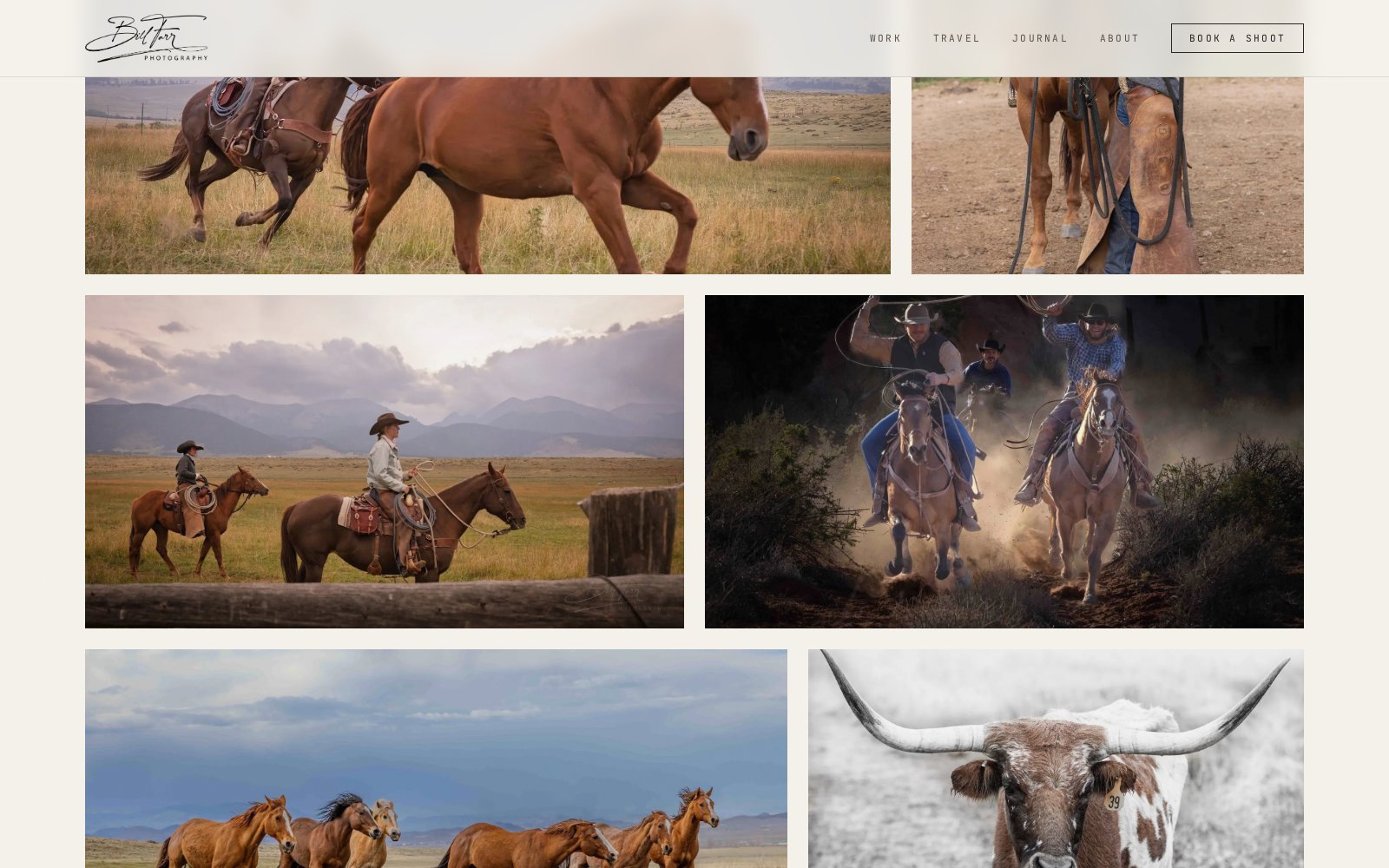
Asymmetric two-column grid with intentional weight variation. Each frame gets space to breathe, and enough negative space to signal that these are prints worth buying.

Bill Farr Photography, Work grid showing Western + travel photography
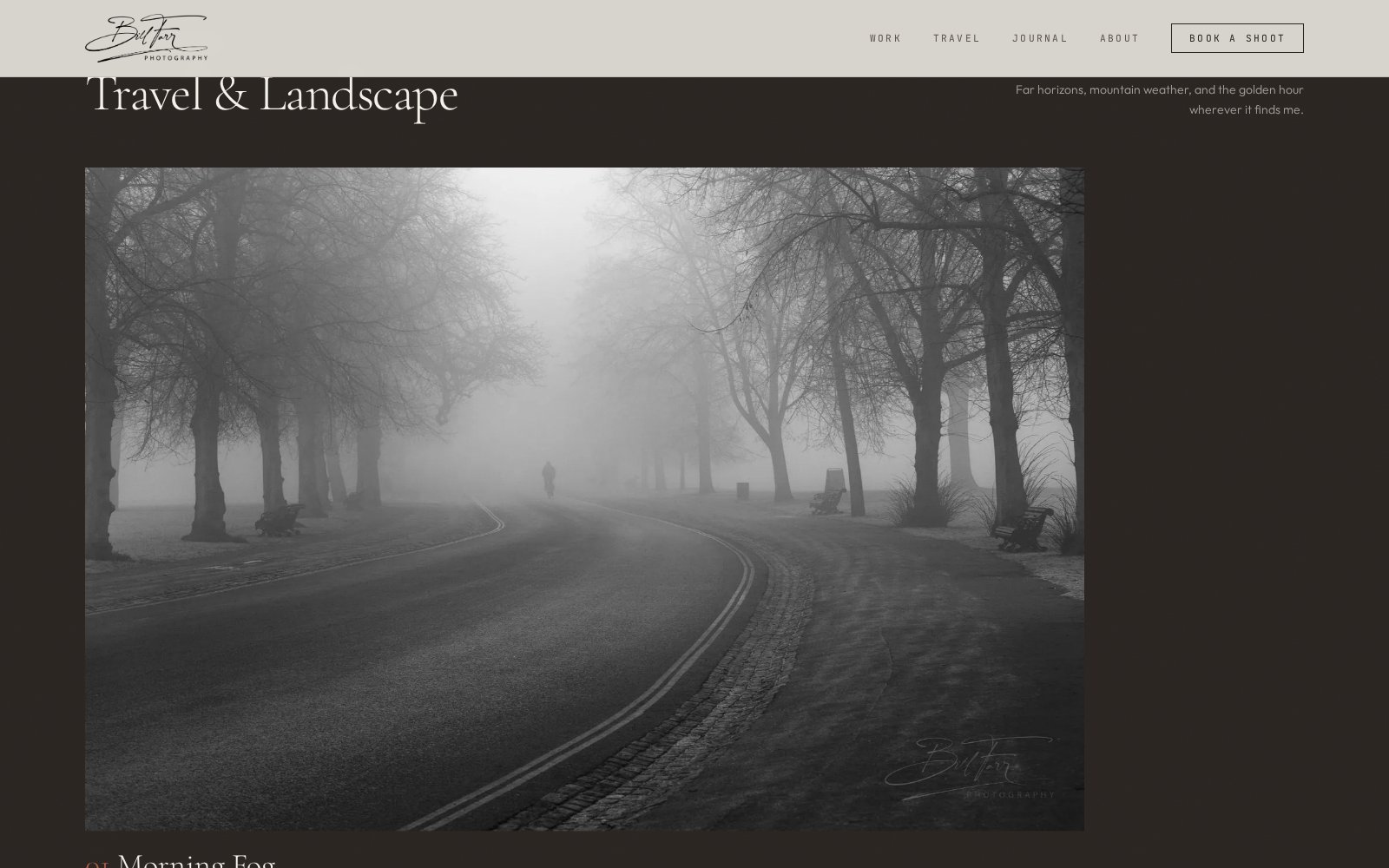
Bill Farr Photography, Travel & Landscape section
05 · Travel & Landscape

Sequenced like a photo essay.

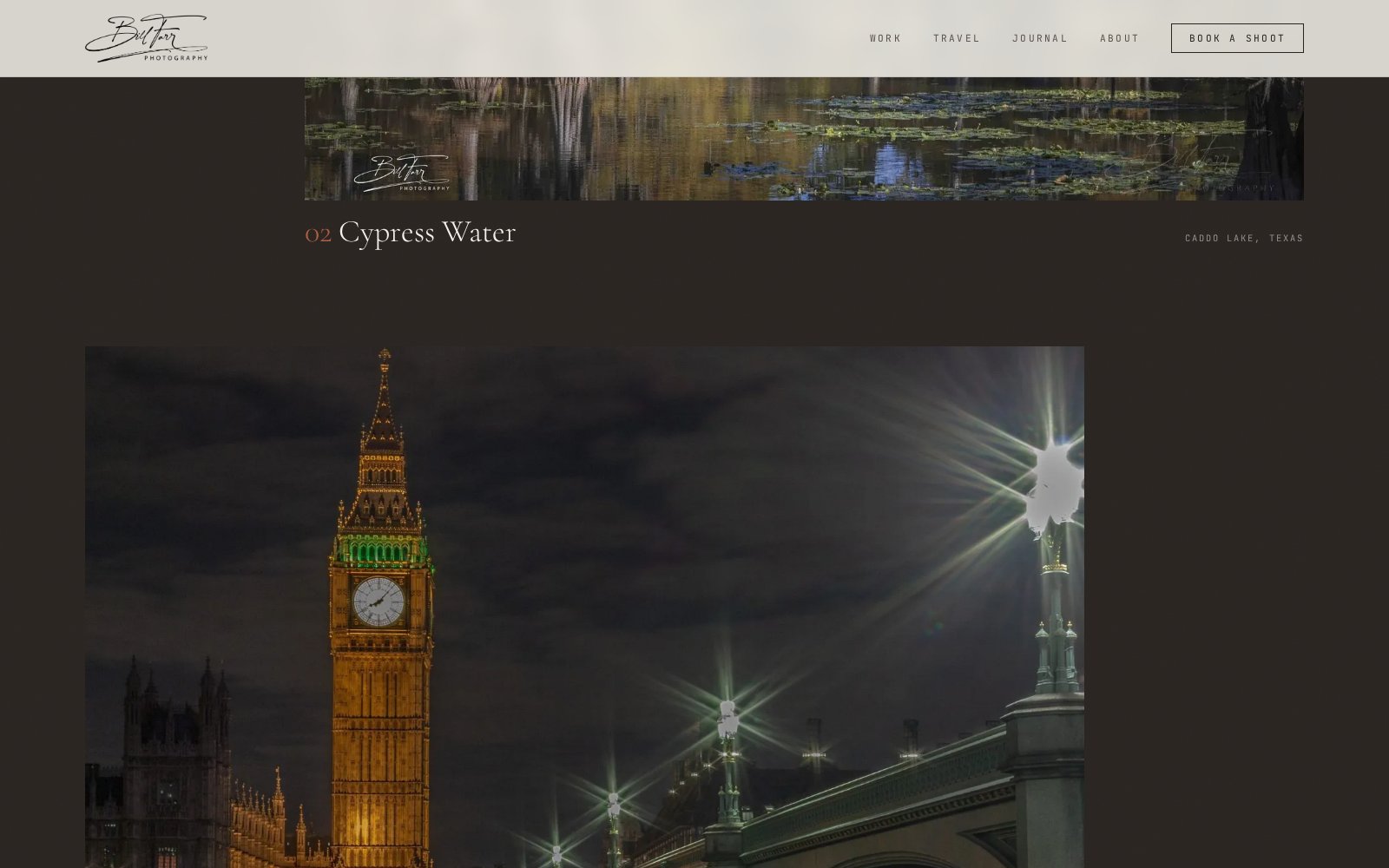
Numbered captions, location tags, and an intentional mono-to-color arc. Reading the travel section feels like flipping through a National Geographic feature, because that's the reference point.

06 · Details

Typography does the heavy lifting.

A hand-drawn signature logo, italic serif display for emotional beats, and a monospace overline system to anchor navigation. Zero utility-first sans, the voice had to feel curated, not generic-modern.

Display
Where light lives.
Overline
Western  /  Travel  /  Prints
Signature mark
Bill Farr
Bill Farr Photography, Cypress Water travel plate
Plate 02 · Cypress Water · Caddo Lake, Texas
07 · Mobile

70% of visits live on a phone.

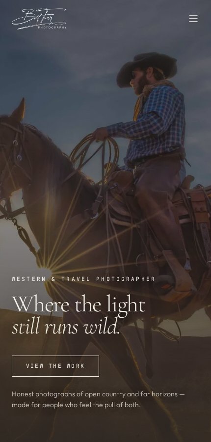
The mobile build is not a scaled-down desktop, it's a purpose-built vertical narrative. Signature mark shrinks to logo-only, nav collapses into a single hamburger, and the hero photograph stays full-bleed with a bottom-anchored caption. No layout shift, no jank, no compromise on print quality.

Full-bleed hero
No sidebars, no framing.
Zero CLS
Reserved spaces per image.
3-tap purchase
Hero → gallery → print.
Bill Farr Photography, Mobile hero
08 · Results

Launch day one.

This was Bill's first-ever website, so there's no "before" to compare against. What we can measure is what a proper launch delivered on day one: real numbers, real inquiries, real footprint on the internet.

Time to launch
6 weeks
Longer than a standard 3-4 week build: a full photo library, a searchable gallery system and the print-store groundwork.
Mobile load
< 2.0s
Image pipeline + reserved-space layout keeps Lighthouse green even on 4G.
Print store
Wired, not live
Hero → gallery → print detail path is built. Switches on when Bill is ready.
Online footprint
0 → live
First website. First searchable gallery. First inbound inquiries from strangers.
09 · The stack

Boring on purpose.

Nothing here is bleeding-edge. Everything here is battle-tested and Bill can hand it to any developer on earth without a lock-in tax.

Design
Figma · custom typography system
Frontend
React · Tailwind · Framer Motion
Content
Headless CMS · image CDN
Print sales
Stripe checkout (phase 2)
Hosting
Cloudflare · edge caching
Analytics
Plausible · privacy-first
Your project

Got a story your site isn't telling?

Whether it's a portfolio, a SaaS launch, or a boutique brand, I only take on projects I can put on this page. Fixed price, fixed timeline, direct line to me the entire way.

© 2026 Mo Studio← Back to all work